In the beginning, there was the ox
Tracing the evolution of letterforms from ancient symbols to contemporary typography
by Francesca Alloatti and Davide Mottes
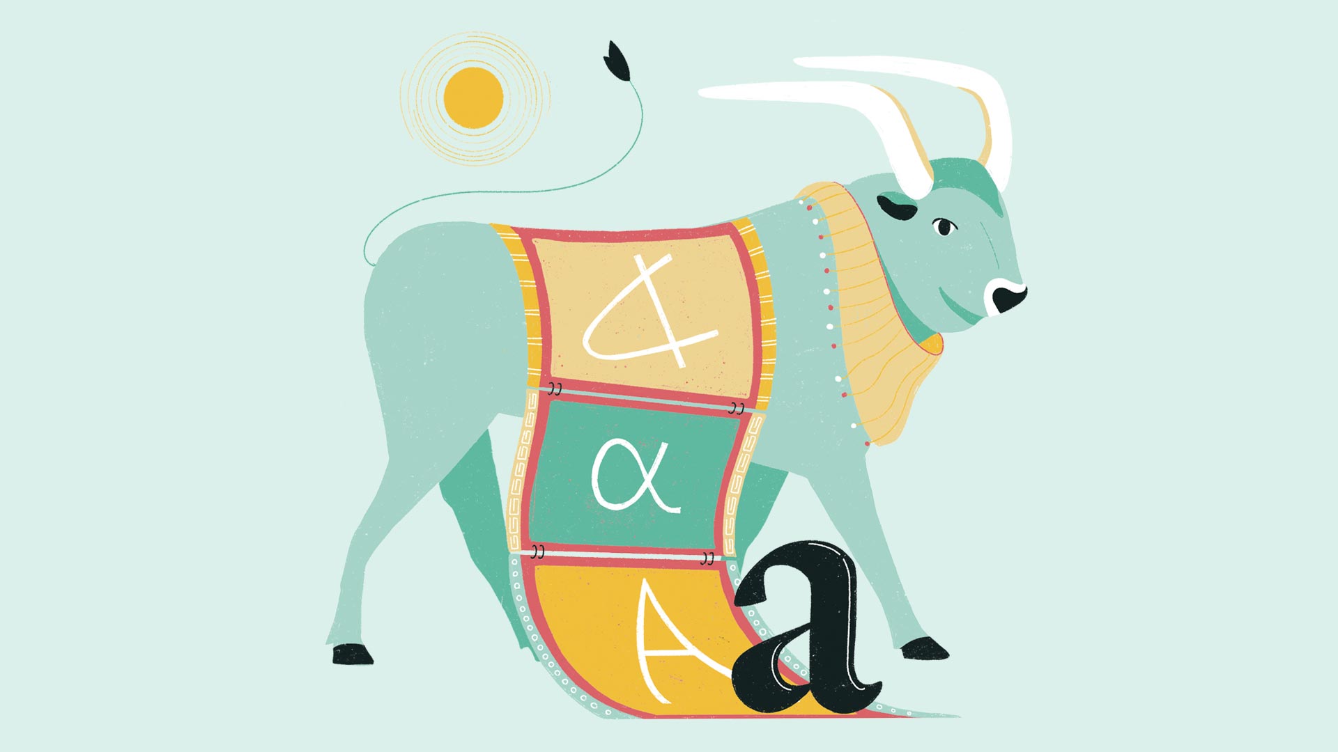
Illustration by Francesca Ragazzi
For many alphabets in the Mediterranean area, the first letter is Aleph. The Phoenicians represented it as “𐤀”, its shape deriving from the Egyptian hieroglyph for an ox’s head. The Semitic word for “ox” probably sounded something like *ʾalp: the symbol “𐤀” therefore depicted the ox, but also the sound we humans emitted when naming the animal, *ʾalp. The physical beast, the word we used for it, and its graphical representation were very close at the time. Then, by the time ancient Greeks started using it, “𐤀” rotated and became “A”. “A” in turn, became the widely accepted transcription of the sound [a].
“A” is often the beginning of the alphabet because it is the first, most direct interface we have with the world: according to Plutarch, “A” is the primary letter because the sound [a] is made without any articulation. The tongue does not move, nor is the mouth shaped in any particular way. It is the sound babies make when they open their mouths for the first time: a gaping, instinctive, loud [a]. We will never know if they were aware of it, but when the ancient Semitic peoples invented alphabets, they were embarking on a path that would eventually lead us, humans of the twenty-first century, to interact with one another by means of an intermediary, written interface that is intelligible to anyone who received a basic education in literacy.
By shifting from a realistic, even semantic representation to a phonetic one we distanced ourselves from reality, making alphabets our primary means of communication between the world and ourselves. The first interface that would allow people to communicate across space and time, asynchronously. An aleph, once engraved on a clay tablet, may be forever.
However, not all alphabets are based on phonograms, such as the Chinese alphabet. But still, it is a representation of reality. According to legend, the original Chinese alphabet stems from the observation of nature. There are other alphabets whose origins remain more mysterious (such as Georgian and Armenian), and whose subsequent evolutions — from the first “lapidary” shape to the sleek, cursive one — drive the connections between alphabetical symbols and reality further away.
Alphabets are physical sounds and signs that have been imprinted on different surfaces over the centuries. Let’s leap forward in time.

Illustration by Francesca Ragazzi
“Letters are things, not pictures of things.” said the English printmaker and type designer, Eric Gill. In this sense, alphabets — or rather, letters — become interfaces per se. They acquire an intrinsic significance that gets enhanced and amplified by typography.
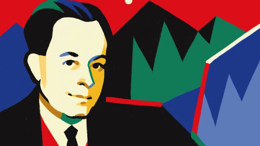
“Gill,” paired with “Sans,” is a combination of words that will sound familiar to many: indeed, Gill Sans is one of the most famous and widespread typefaces. Inspired by his mentor Edward Johnston, who created the “Underground Alphabet” for the London Underground in 1916, Gill Sans has become one of the most popular and widely used typefaces in the world. This case illustrates how many typefaces we commonly use today are named after their creators. For instance, Claude Garamond, a sixteenth-century French typeface designer, created the Garamond typeface, which remains a classic. Similarly, British designers William Caslon and John Baskerville in the eighteenth century created the Caslon and Baskerville typefaces, respectively, both of which are still in use today, with Caslon providing the letters for the American Declaration of Independence. The Italian typographer Giambattista Bodoni also left a lasting legacy; starting from the second half of the 18th century, he transformed Parma into a world capital of printing, designed the revolutionary Bodoni typeface, and published the renowned Manuale Tipografico.
Gerard Unger, a renowned Dutch graphic and type designer, once remarked, “Of all designed objects, letters are probably the most pervasive, very familiar yet amazingly diverse in their appearance. Letterforms range from the almost anonymous and utilitarian in large quantities to a few individual and exceptional shapes. Between such extremes, designers have devised almost all possible variations; there seems to be no limit to human ingenuity when it comes to varying letterforms.”
This observation highlights the fascinating intersection of art, history, and science in type design. Each typeface carries with it centuries of tradition and cultural significance, making type design an ever-evolving craft. Designers must carefully balance aesthetics with functionality, often tailoring typefaces for specific uses, such as long-form reading or quick recognition on road signs.
This intricate relationship between design and function is at the heart of typography, which refers to the reproduction of text through coded and repeatable signs and its organization within space. Typography is not merely about choosing a font; it is a method of sharing information that relies on the repetition of signs and the duplication of texts. As a form of writing that requires reproduction technology, a matrix, and a medium, typography has evolved radically throughout history. The technological advances that have transformed typefaces from physical objects into purely virtual entities are a testament to the constant innovation and adaptability that Unger so aptly described.
Building on this understanding, typography also plays a crucial role in human communication. The design of the type sets the tone, influencing the reader’s perception by conveying a specific mood. The right font choice enhances visual appeal and adds an attention-grabbing element to designs. Consistent use of typography also helps create a strong brand identity. When a brand consistently uses the same typography across all its communications, it reinforces its brand image and maintains a cohesive corporate identity.
The profound impact of typography on communication is undeniable. As another brilliant Dutch graphic designer, Karel Martens, stated, “Letters are, in essence, keys to transmitting information.”
This reinforces the idea that typography is not just an art form but a fundamental interface in how we share and perceive information across time and space.