Cartographies of time
What does time look like? Daniel Rosenberg and Anthony Grafton curated the first visual history of the timeline.
by MAIZE
For centuries, humanity has been struggling with the need to make this mysterious abstraction concrete. That desire has been realized in countless ways, and not only visually: early clocks, for example, used bells to make regular, repeated sounds to mark time. When it comes to depicting the shape of time before our eyes, people have employed many different metaphors, but, among these, the metaphor of the line has always been crucial. We find lines everywhere in visual representations of time — in almanacs, calendars, charts, and graphs – and of course in the language that we use to talk about time, too. Timelines are such a familiar part of our mental furniture that it’s hard to imagine a concept of time that is not in at least some way linear. Even when we think of time as a wheel or a spiral, for instance, those shapes are made from lines. And yet the timeline as we know it — a straight, measured line, like a meter stick — is little more than 250 years old. What came before it is a rich and surprising landscape of imagination that no one had studied in depth until 2010, when Daniel Rosenberg from the University of Oregon, and Anthony Grafton, from Princeton University, published Cartographies of Time, the first comprehensive history of the timeline.
What’s the reason behind such abundance of representations? “Time, like space, life, love and death, is a fundamental, pervasive and omnipresent abstraction,” Rosenberg says. “When a phenomenon is so deeply important and ever-present, but immaterial, there is generally a drive to make it concrete in one way or another.” The recording of time sequences is very old. For example, carvings found by archaeologists reveal that already tens of thousands of years ago, Neolithic hunters kept records of their lunar observations. The carvings they made helped them know how long they had been chasing animals and how far they had traveled. Today, we satisfy our need to plan and record our activities with the help of calendars and clocks. All of these devices have a linear aspect to them, but their purpose is conceptually different from that of a historical timeline, Rosenberg argues: “Even as they show us moving forward through time, both calendars and clocks emphasize cyclicity. They represent the passage of time through repetition. Days, weeks, and years all repeat. And these conventions of timing are associated with habits: on Sundays perhaps we don’t work; on New Year’s Eve we make vows or light fireworks. It is for this reason that we can we make sense of a sentence such as ‘Today feels like a Monday!’ which would otherwise be a very strange idea indeed. Timelines do the opposite job: they de-emphasize cyclicity as they represent the passage of time on a larger scale. But make no mistake: even the most linear historical timeline cannot do away completely with the cycle, just as the most cyclical view of time cannot completely extinguish a sense of forward movement. In short, the senses of time evoked by the timeline on the one hand and the clock and calendar on the other are interdependent.”
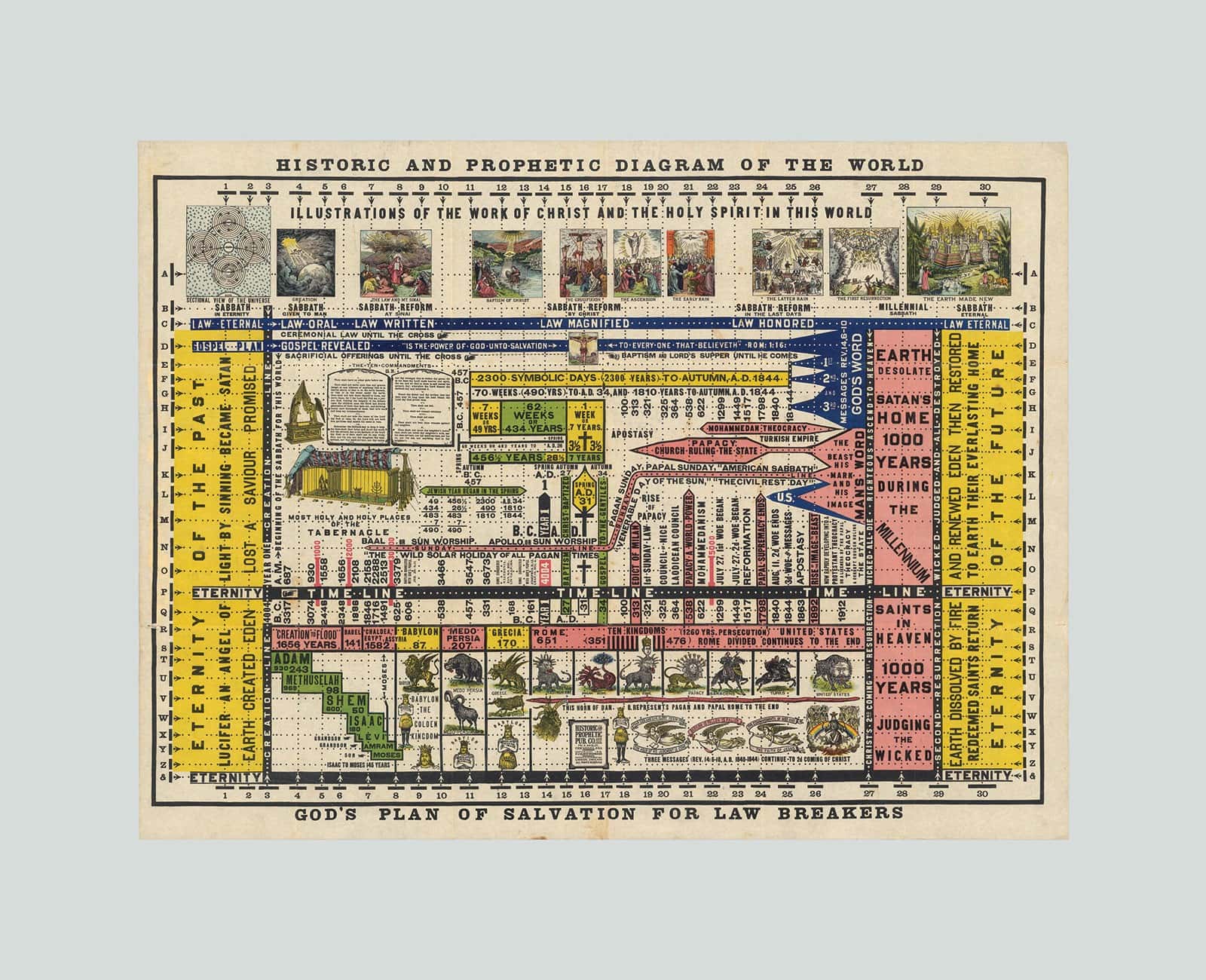
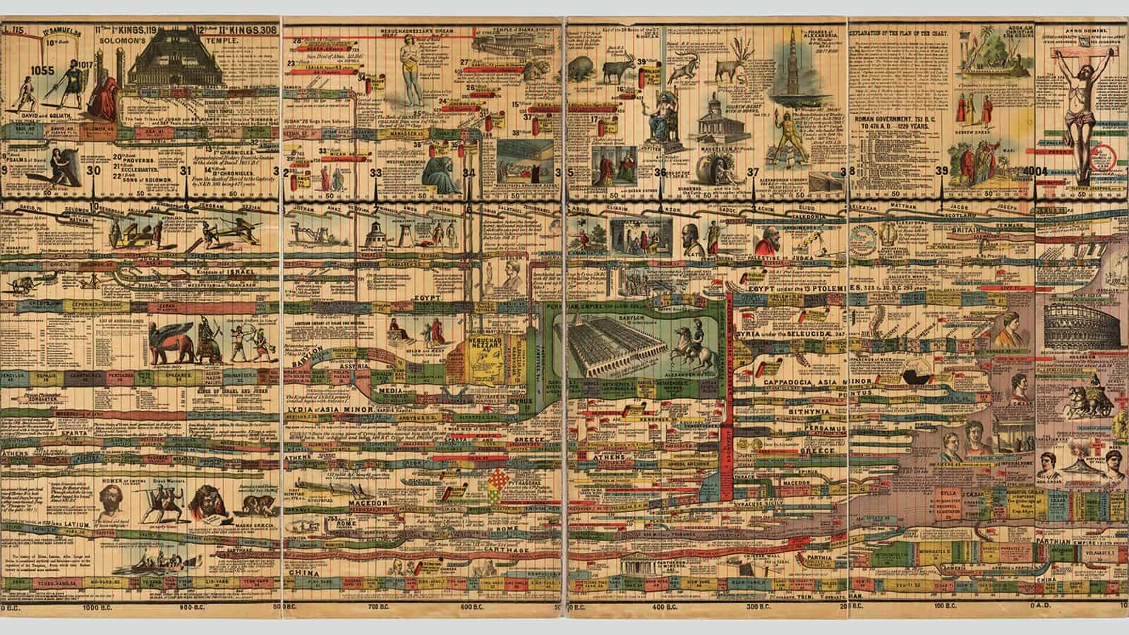
In their book, Rosenberg and Grafton take the reader on a journey using graphical artifacts that were conceived in the last several centuries to portray the course of history. Some of them are so different from modern timelines that they barely seem related. In some cases, these chronologies fill entire books: in the early years of moveable-type printing, in 1474, German humanist, Hartmann Schedel, published the Nuremberg Chronicle, an illustrated world history beginning from the Bible where the protagonists were depicted as fruit of elaborate trees. Schedel left three blank pages at the end of his book where readers could fill in events to take place in the time between the book’s publication and the impending Apocalypse. In his 1585 Anatomia statuae Danielis, Saxon scholar Lorenz Faust drew the statue described in the Book of Daniel as representing the four great kingdoms of world history. Faust recorded registered these upon the statue by inscribing the names of the rulers of each kingdom on the statue’s body, head, and limbs. And Johannes Buno, a history teacher in Lüneburg, found a unique method to make historical events memorable to his students. He associated symbolic, allegorical images (an eagle, a set of planks, a camel, a dragon) to each of the four millennia that stretched from Creation (said to be 4004 BC) to the coming of Christ. He did the same with the 17 centuries between Christ’s birth and his own time: the second century was a bear, the fourteenth a vessel of oil, and so on. Those images formed the chronological background, while in the foreground Buno placed images of important men and women from corresponding periods, each carrying out their proper task: Seth — Adam and Eve’s son — for example, holds the two pillars of knowledge built by his descendants, while the astronomer, Ptolemy, looks at the sky. In the early modern period, chronology was often visualized and memorized through the use of vivid allegorical images such as these.
During the same period, tables of time were employed, as well, but it was only around the middle of the eighteenth century that we find the first examples of measured, linear timelines that look like the ones we are familiar with today. In these, time is projected onto a single, continuous plan that can be visually scanned like a geographic map. In these charts, proportions between space and time are rigorously observed, and pictorial allegories give way to abstract, measured lines. Time charts, in short, function like tools of scientific measurement. This shift, professor Rosenberg says, is closely linked to fundamental changes in the way we look at history. “In the seventeenth century, Europeans started to think of historical change as something driven by themselves, not by extrinsic forces,” he says. “Prior to that moment, of course, people knew that human actors could make a difference, but the larger shape of history — the millennial shape — was thought to be controlled by other forces. During early modernity, the influence of human action upon that greater shape of history became a question. This obviously does not mean that everyone suddenly thought that God was dead: on the contrary, even today, the idea that the direction of history is divinely determined is widely held. But in the modern period, other narratives came both to collaborate and to compete with the theological one. Thus, from the seventeenth century, in visual culture, it became newly important to represent the relationship of events in history to the larger shape of history itself. And not through allegories linked to a providential idea of history, but through patterns observed in historical events.”
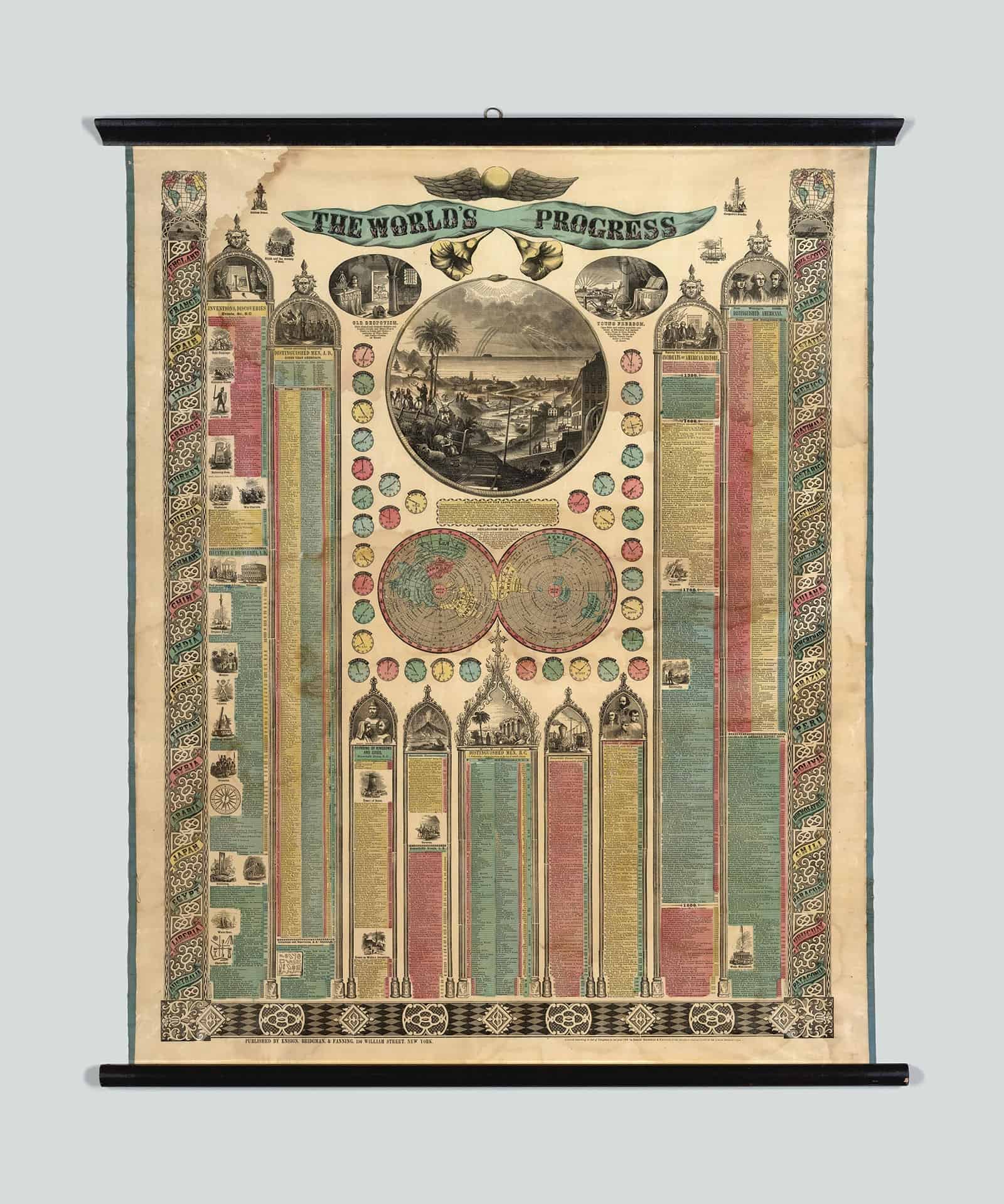
In this respect, the modern timeline fits into a longer history of graphic representations of time, which very much includes the kinds of religious allegories represented by figures such as Schedel, Faust, and Buno, while also marking something different, something new in the history of time. Many of the innovators of the first modern timelines were very devout people, but the graphic formats they pioneered typically set millennial questions aside. Among the best examples of this tension, Rosenberg points to two charts by the late-eighteenth century English scientist and theologian, Joseph Priestley, best remembered as the discoverer of oxygen. The first of these, the Chart of Biography from 1765, shows when famous people lived and died. The second, the New Chart of History from 1769, depicts the rise and fall of empires. Both of them plot their data along a measured line. In their book, and in the new digital project, Time Online, Rosenberg and Grafton describe Priestley’s charts as among the most influential of the early modern period. “Priestley’s charts have lengthy theoretical explanations that go along with them,” says professor Rosenberg. “The charts begin in 1200 BC and end in 1800 AD, thus placing events in the frame of secular, historical time. Priestley was a millennialist: he believed in the imminence of endtimes. But, as a scientist, he decided it was not his task to represent the millennial story on his chart. That’s why his timeline starts well after the supposed beginning of the world and ends in the near future. Within this defined period, Priestley could apply a rigorous historical method without worrying about theologically controversial subjects such as the age of the earth. It allowed him to focus on other kinds of questions: how do ideas spread; how do discoveries in one field influence discoveries in another; what is the relationship between events in the history of nations and events in the history of ideas?”
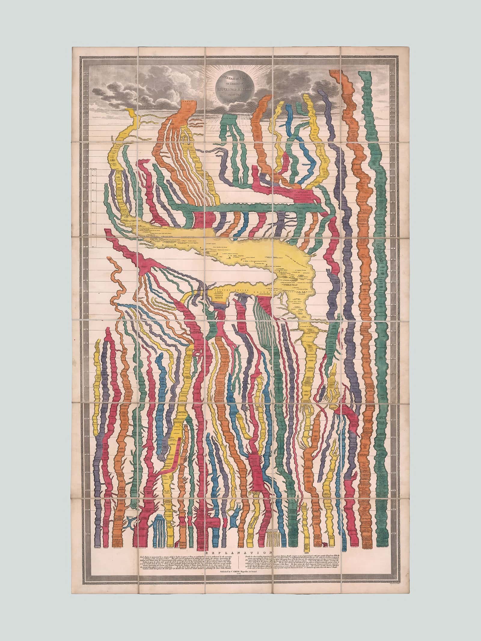
The abstraction of the simple, measured line promoted by Priestley proved to be persuasive. Very quickly, his timelines were widely imitated across Europe and beyond. But their success did not mean the end of other ways of representing historical time. The old temporal metaphors of streams and trees, for example, continued to be widely used. Still today, when we represent the succession of generations, we often do so in the form of a tree. “Graphically, the tree, too, is a powerful device,” says Rosenberg, “and over the centuries it has proven itself to be a very effective mechanism to represent succession. A tree diagram shows relationships among events, things, or ideas. This distinguishes it from timelines of the sort that Priestley made which assert no causal relationships among events, only chronological order. Trees and rivers also differ from the linear timelines in that they branch; they are intrinsically plural. In one way, this makes them very appealing. The branches can help us see different paths and imagine alternatives. And yet, in another way, the linear timeline is the more conceptually open format. By representing events in parallel with one another without asserting specific relationships among them, the timeline establishes a framework in which to ask rather than to answer questions about cause and effect. In a funny way then, the linear timeline may turn out to authorize more plural thinking than the visually branching tree.”
How might this plurality manifest itself in the future? Rosenberg has an answer: “An interesting example of the kind of alternative thinking that may be fostered by the linear timeline arises in recent discussions of the Anthropocene. For an eighteenth-century thinker such as Joseph Priestley, the regular, measured timeline provided a framework for studying and contemplating human history on its own, apart from theological questions about the larger shape of time. But, if the theorists of the Anthropocene are right, Priestley’s timeline—as a framework for human history in and of itself—is already a map of a larger framework of time. And his depiction of the shape of human history as a meaningful aggregation of apparently independent events is already a map of the organized complexity that produced the Anthropocene. As a thinker of the Enlightenment, Priestley believed that the increasing prevalence of discovery, industry, and commerce in modern times – phenomena visible on his charts — reflected the self-reinforcing effects of progress. While these processes were unplanned and decentralized, Priestley believed that they were also accelerating and irreversible. Eventually, he argued, unstoppable progress would bring a better day for all humanity. On the question of progress, the claims of the theorists of the Anthropocene are just about diametrically opposed to those of Priestley, yet Priestley’s charts provide a striking visualization of the same phenomena with which they are concerned. Perhaps the theorists of the Anthropocene ought to be looking for new visualization tools to express their understanding of global history. But it is also possible that visualizations from the first great era of industrialization such as those of Joseph Priestley already do the job in a compelling way. If this were the case, it would be a poignant but not entirely surprising irony.”


